Royal Caribbean wave rider cruise ship

Flight Centre Cruise eCommerce

Stakeholder

Flight Centre

Years

2019-2020

Role

UX/UI design

In 2018 a new cruise booking platform was launched on the Flight Centre website. The platform was designed to be a replacement for the Cruise About brand when it merged with Flight Centre.

After the booking platform was live for six months the product owner wanted to improve conversion rates, so I was tasked to help find any potential opportunities to improve the cruise experience for Flight Centre customers. I was the only designer in my team, working with the product owner and two developers. I also collaborated with designers in other teams to broaden my insights from their learnings in their niches.

Product goals

  1. 1

    Give customers an amazing experience online throughout the dreaming, planning and booking phases.

  2. 2

    Increase click through and conversion rates on the cruise eCommerce platform.

  3. 3

    Provide Flight Centre consultants in stores with better quality cruise enquiries.

Cruise Ship

Approach

  1. 1

    Features were to be prioritised based on value for the customer through their feedback.

  2. 2

    Lean, MVP approach. Staggered release of features, iterating to refine solutions.

  3. 3

    Gather feedback and monitor sentiment using customer surveys throughout the process.

  4. 4

    Run A/B tests to trial new ideas and validate on the fly.

Research methods studying girl illustration

Research methods

  1. Customer feedback (enquires & surveys)

  2. Pattern research for existing mental models

  3. Behavioural data in Google Analytics

  4. Cruise market research analysis

  5. Travel industry insights

Example of a cruise customer feedback survey

Customer research

I spent time gathering feedback and insights through quantitative customer surveys with Usabilla, sourcing behavioural data in Google Analytics, email enquiries from the cruise eCommerce platform, and gathering qualitative feedback from customer interviews that were conducted after the platform was initially released.

  1. Profile avatar illustration

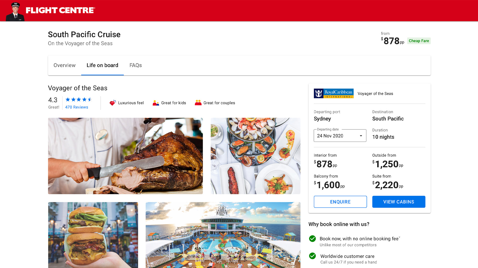
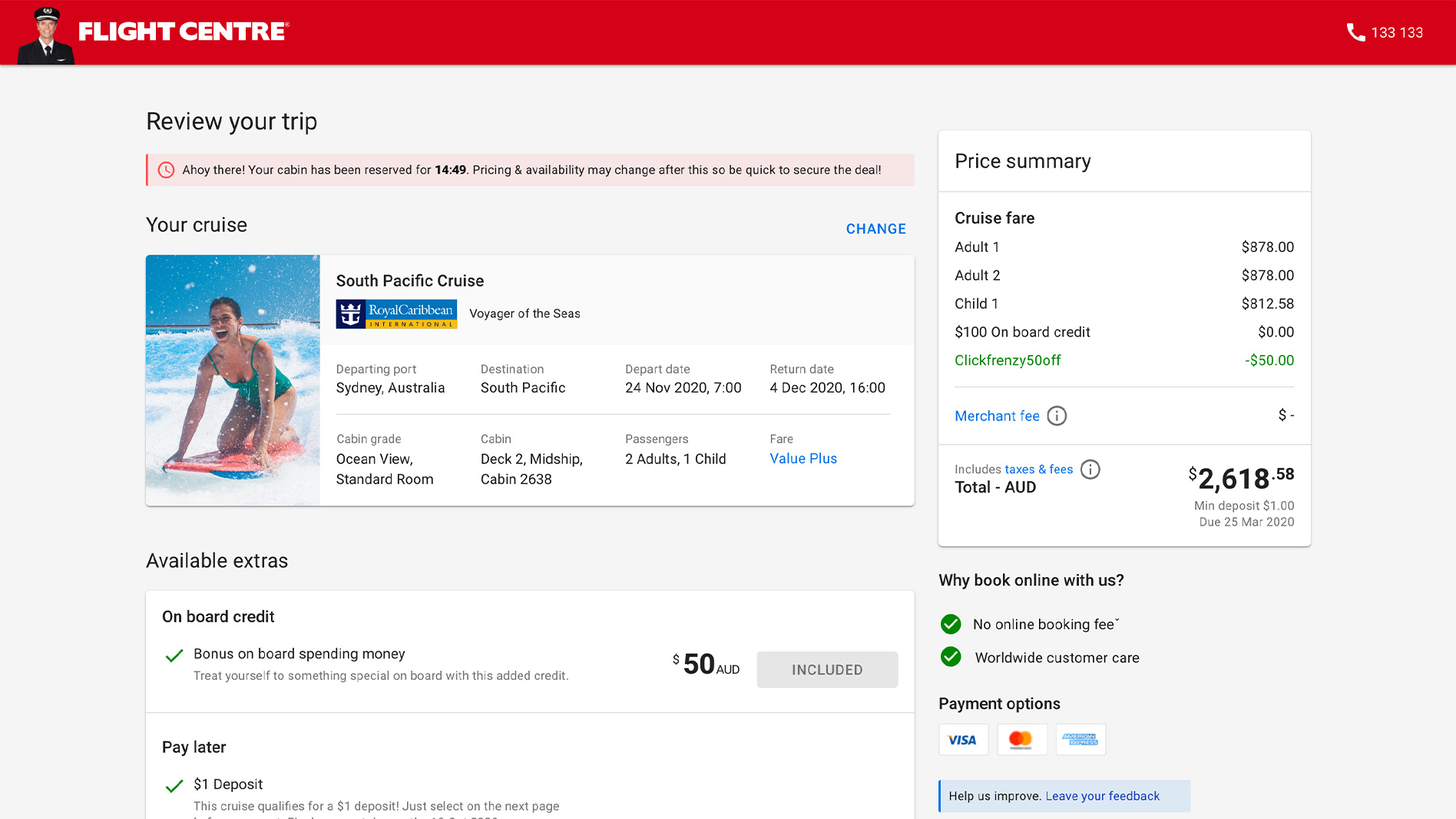
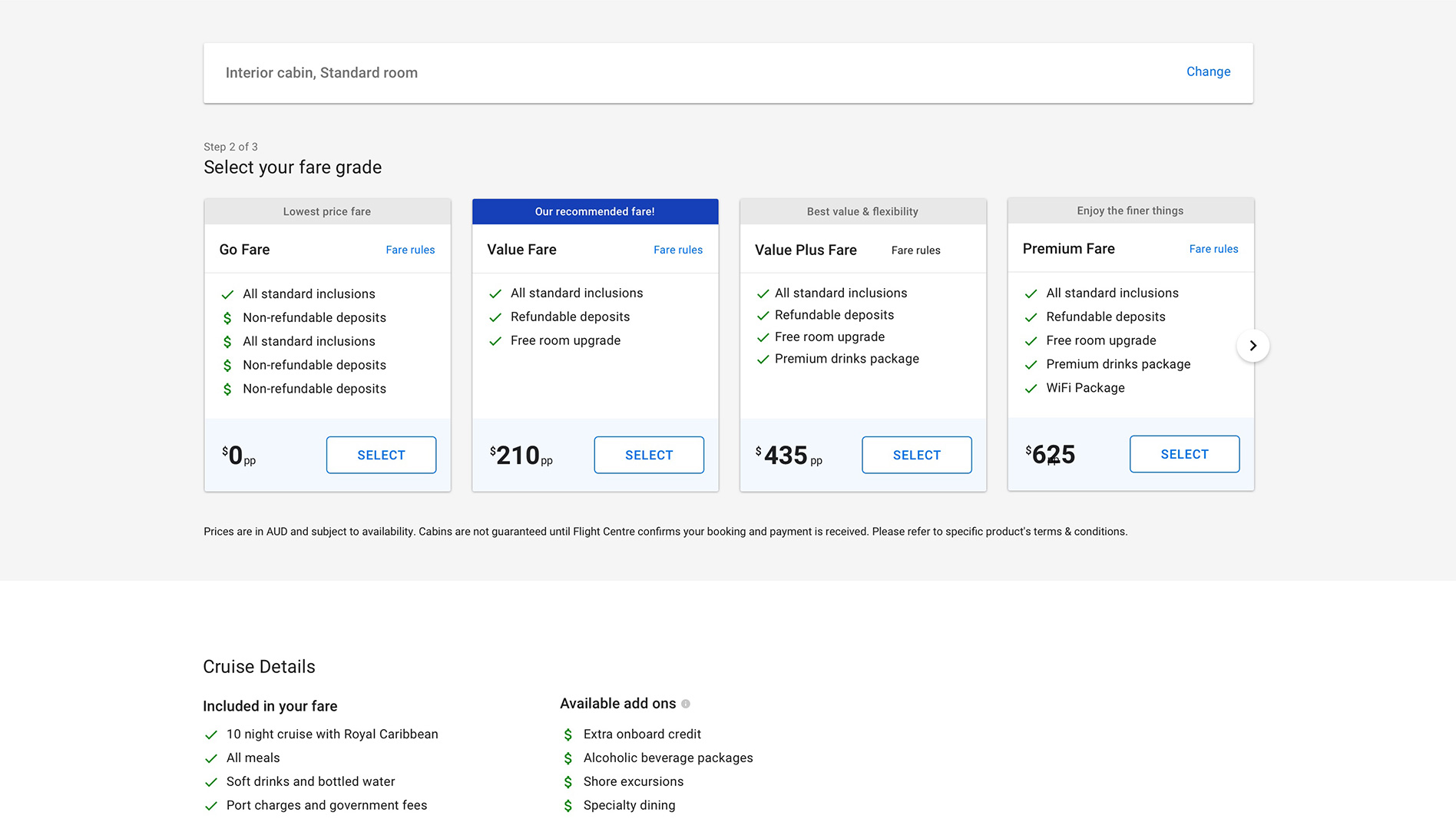
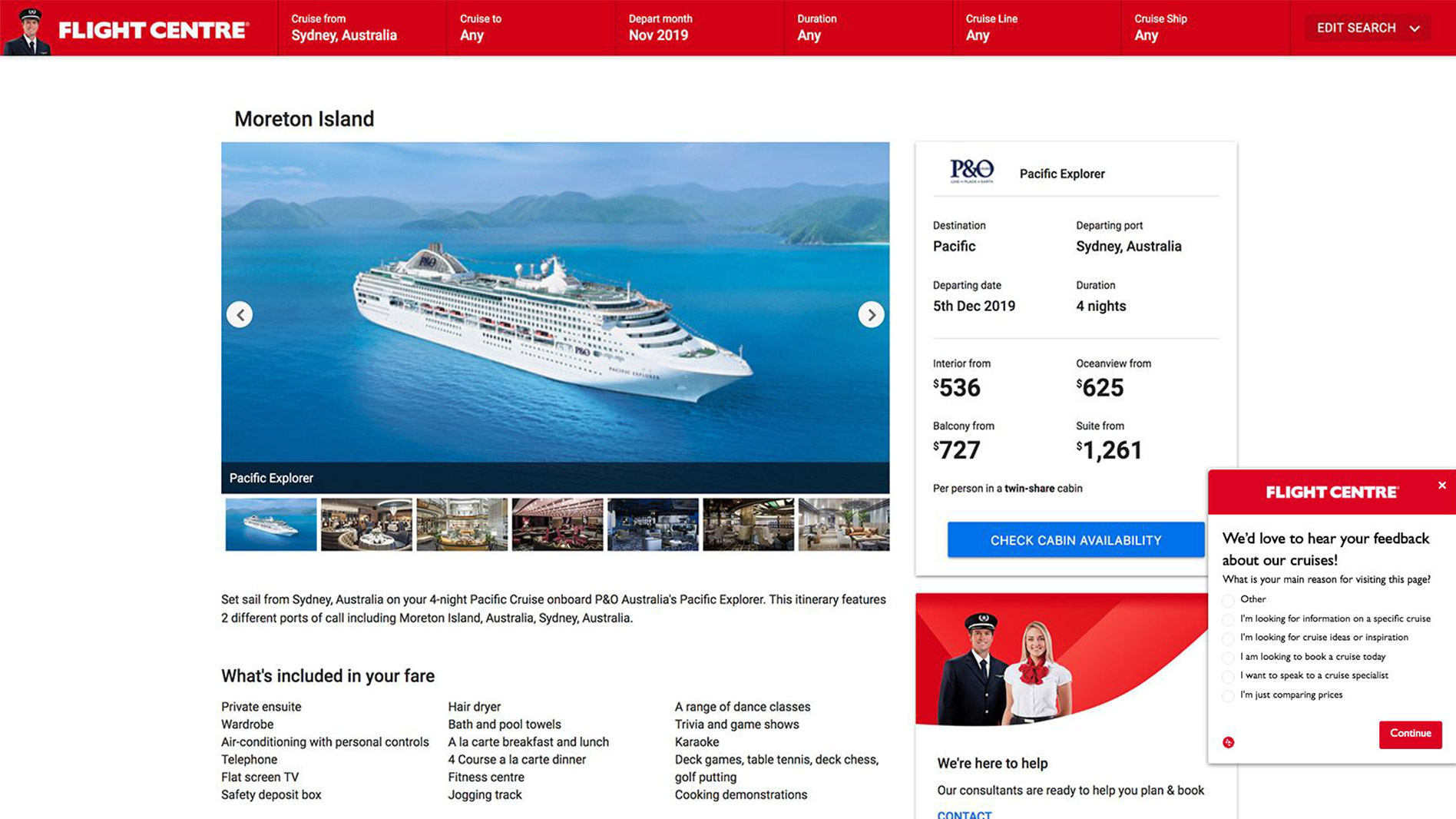
    “What’s included in the cost of the cruise?”

  2. Profile avatar illustration

    “Just wondering if it comes with the drinks package?”

  3. Profile avatar illustration

    “I don’t know where I want to go - not much inspiration.”

  4. Profile avatar illustration

    “Can you send me some pictures of the cabin and bathroom?”

  5. Profile avatar illustration

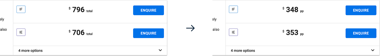
    “Is that pricing per person?”

  6. Profile avatar illustration

    “I’m not sure what the letter keys represent, please excuse if I’ve done something wrong.”

Customer feedback from surveys and enquiries

Research findings

  1. 1

    Not enough information about the cruise

    The cruise platform had been designed to follow the same layout as hotel products on the website. As cruise product is more complex than hotels, this meant there was not enough information for customers to feel confident to book online. This was also evident after performing a competitor analysis.

  2. 2

    The price messaging was confusing

    On the search results and top of the product page pricing was listed as a ‘per person’ rate, however when selecting a cabin on the product page, the price changed to a total amount which was confusing our customers.

  3. 3

    Lacking in opportunities for up-sells

    Many customers were requesting add-ons to their cruise such as drinks packages. These were not available as the cruise platform did not offer any upgrades to the standard fares on offer.

AB Tests

Testing and validating

In order to test ideas early on, we ran proof of concepts as A/B tests with Optimizely to validate our hypotheses and ensure the improvements were on the right track for our customers.

It was important to get the price messaging right, so this was compared using an A/B test to see how it would perform with our customers.

Solutions

  1. 1

    More in-depth content

    Redesigning the product page and adding more engaging content meant that whether customers were new to cruise, or experienced cruisers, there was a lot more information and inspiration to help dream, plan and book their holiday.

  2. 2

    Consistency around price messaging

    After researching and rethinking how prices should be communicated throughout the cruise flow, the A/B test we ran with the new design saw a 15% improvement on the original.

  3. 3

    Added fare grades into the booking flow

    Similar to airlines, cruise fares upgrade bookings with on board credit, WiFi and drinks packages. We received many requests for this from our customers, so after it was released we saw cruise bookings increase month on month.

Cruise product page on scroll Cruise product itinerary Cruise facilities

After adding more cruise information for customers, the content was reorganised and then categorised into separate sub pages using tabbed navigation.

The most important content was laid out on the ‘overview’ sub page, with information about the ship experience and FAQs moved to secondary pages.

Life on board a cruise ship mockup

The ‘life on board’ sub page included everything to do with the ship, including deck plans, facilities, and ship stats (which dedicated cruisers love).

Mockup of cruise commerce basket page

The way pricing was communicated was changed to give more consistency and clarity for customers, including a per person breakdown for transparency.

Mockup of new fare grades on cruise product page

Fare grades were added in to the booking flow on the product page, giving customers more choice so they could upgrade their cruise before booking.

Next Project

Drive Car Hire