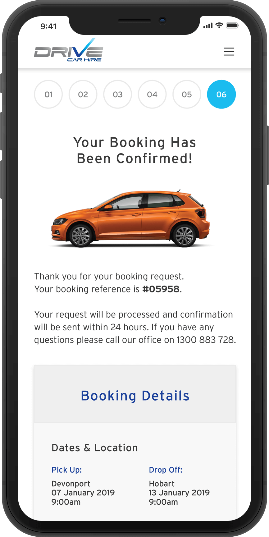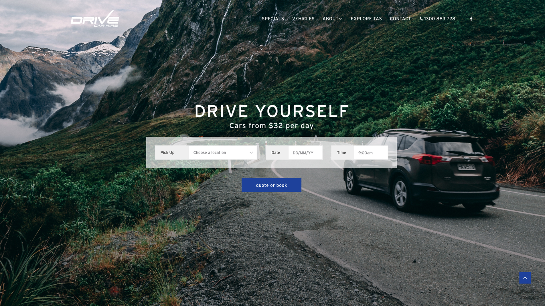
Drive Car Hire is a car rental company based in Hobart, Tasmania. They were looking to improve their customer’s experience and increase online bookings with an overhaul of their current website.
I worked closely with the project manager to collaborate with the client, and two developers to create the new website. The internal marketing teams also helped produce SEO content and SEM ads. It was my responsibility to help discover and scope the project requirements and then determine the best solution to meet the requirements and give the best outcome for their customer base within a limited timeframe.
Anna and John were finding it was becoming more difficult to attract new customers and retain visibility in an increasingly competitive space with larger third party hire companies moving into the Tassie market.
The project manager and I spoke with Anna and John about their vision for the business, what they were finding worked well and what needed improving.
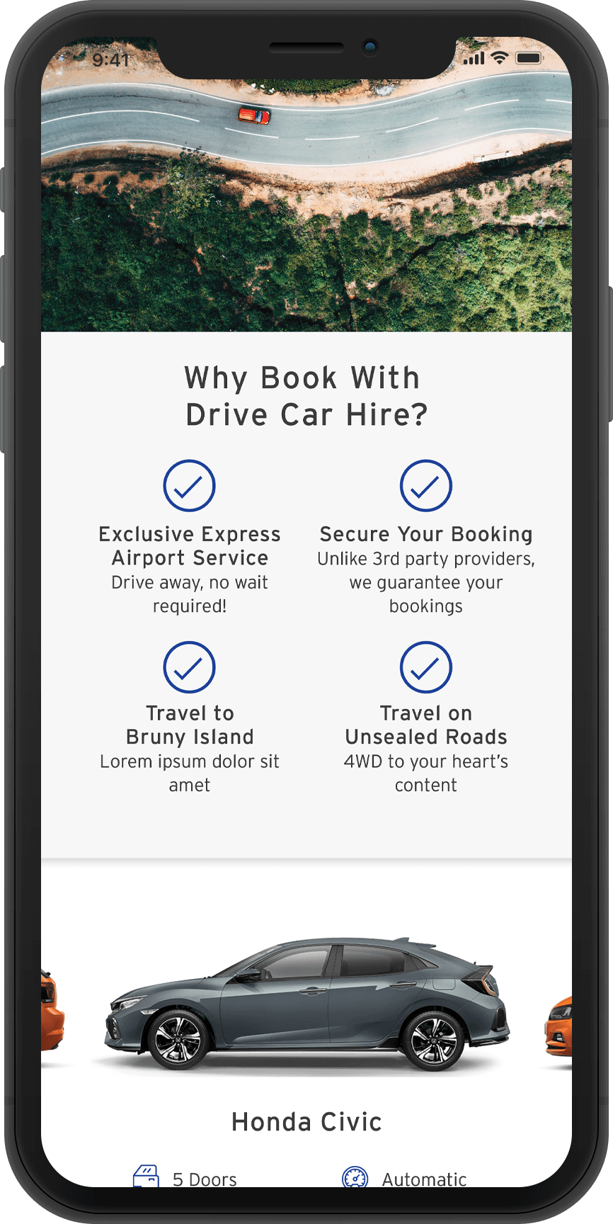
Update their website to match their new branding.
Convert more customers through the website rather than over the phone.
Improve visibility through Google with better content, SEO and SEM ads.
Car hire market research analysis
Pattern research for existing mental models
Heuristic review of the online booking flow
Anna and John had many local partnerships with vendors in Tasmania where they could offer their customers competitive rates for other activities and services on their trips.
Anna and John had some fantastic value propositions that were not clear through the overwhelming amount of information on their exisiting site. These USPs offered a great opportunity to highlight some of the benefits of booking through a local small business.
There was a lot of drop off from customers finding the current booking engine difficult to use. We learnt their customers would usually call to book. Unfortunately their analytics was not set up properly in the checkout flow so there was no historical data in Google Analytics to corroborate any findings there. This meant we had to rely on anecdotal evidence from the client.
They were using an integrated booking platform that they explained was difficult to use, and suspected that it was the reason why their customers weren’t booking online and were calling instead. They were locked in to using this tool, so we had to work with what they had.
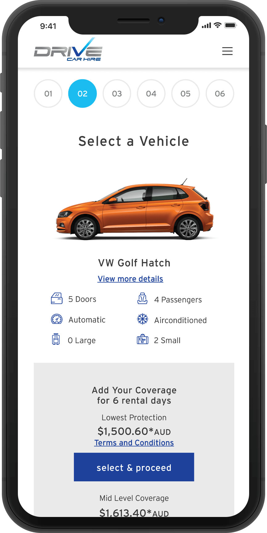
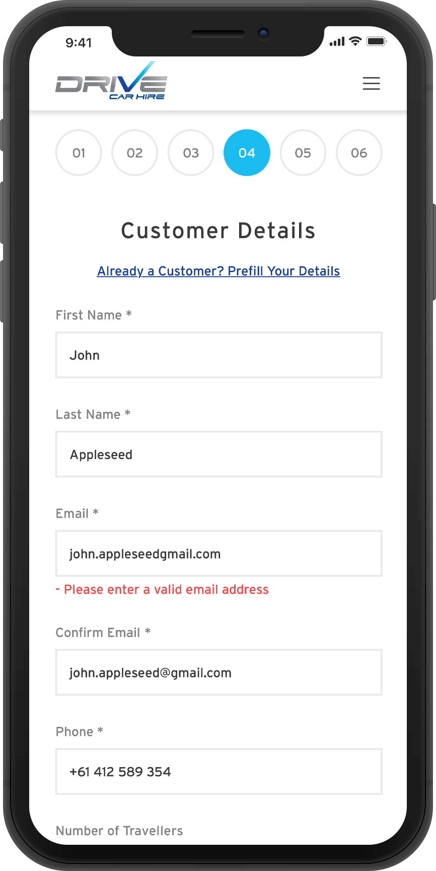
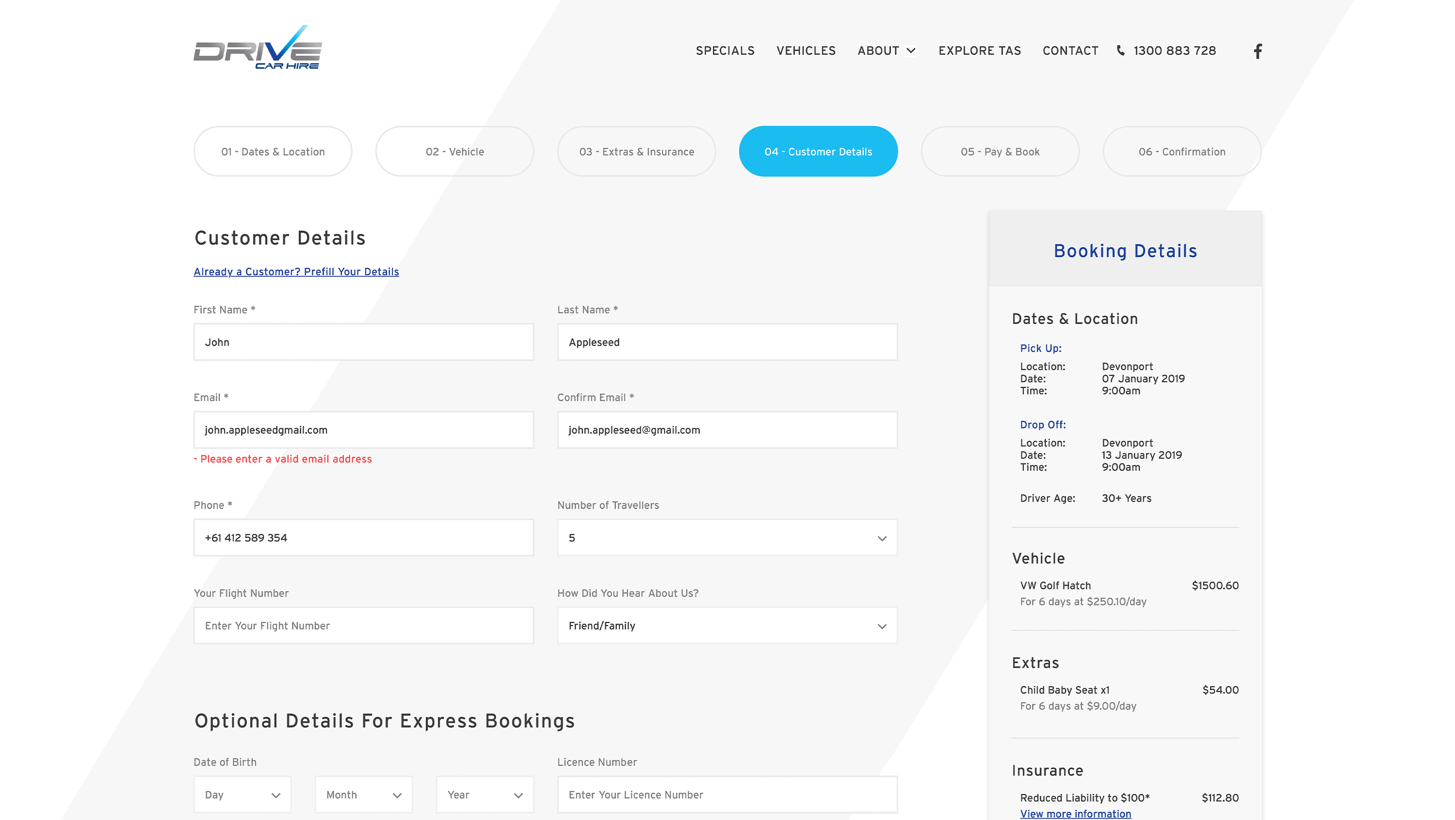
Each page of the booking engine could handle front end modifications to improve the user experience, the only page that couldn’t be altered was the payment page. Therefore it was important spend time improving the customer experience for the rest of the checkout flow.
The checkout pain points became apparent after researching and performing a competitor analysis. There was not a lot of clarity about insurance, and there was a lot of information required from customers prior to making a reservation that could be requested post-booking.
When discussing this with the client they confirmed that these were the sorts of questions their customers were asking when calling to book over the phone.
Creating a section of the website for special offers and local attractions would help contribute to better rankings on Google - a win win for improving organic search visibility and showcasing some of the benefits of booking with them to visitors.
The new checkout flow was modelled around existing mental models, best practices and learnings from market competitor analysis.
Similar to airlines, cruise fares upgrade bookings with on board credit, WiFi and drinks packages. We received many requests for this from our customers, so after it was released we saw cruise bookings increase month on month.
#1E429B
#1bbcef
#d9f3ff
I added design flourishes to build on their brand identity. I used ‘Interstate’ font on their website which is based on lettering used in street signage and included subtle animations and transitions in the design to emphasise motion and give movement.
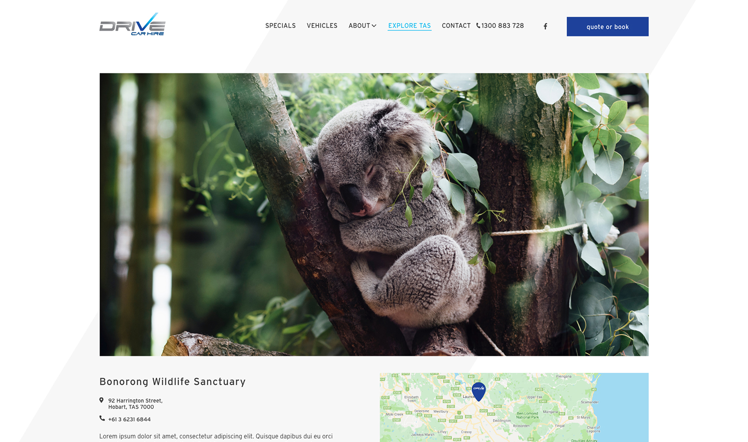
We used their unique partnerships to create special offers along with pages about things to do with local vendors in Tasmania which their customers could use as a guide.
These included a mix of tourist hotspots as well as the activities by local vendors, with some information along with the hours of operation, contact details and a map for context.
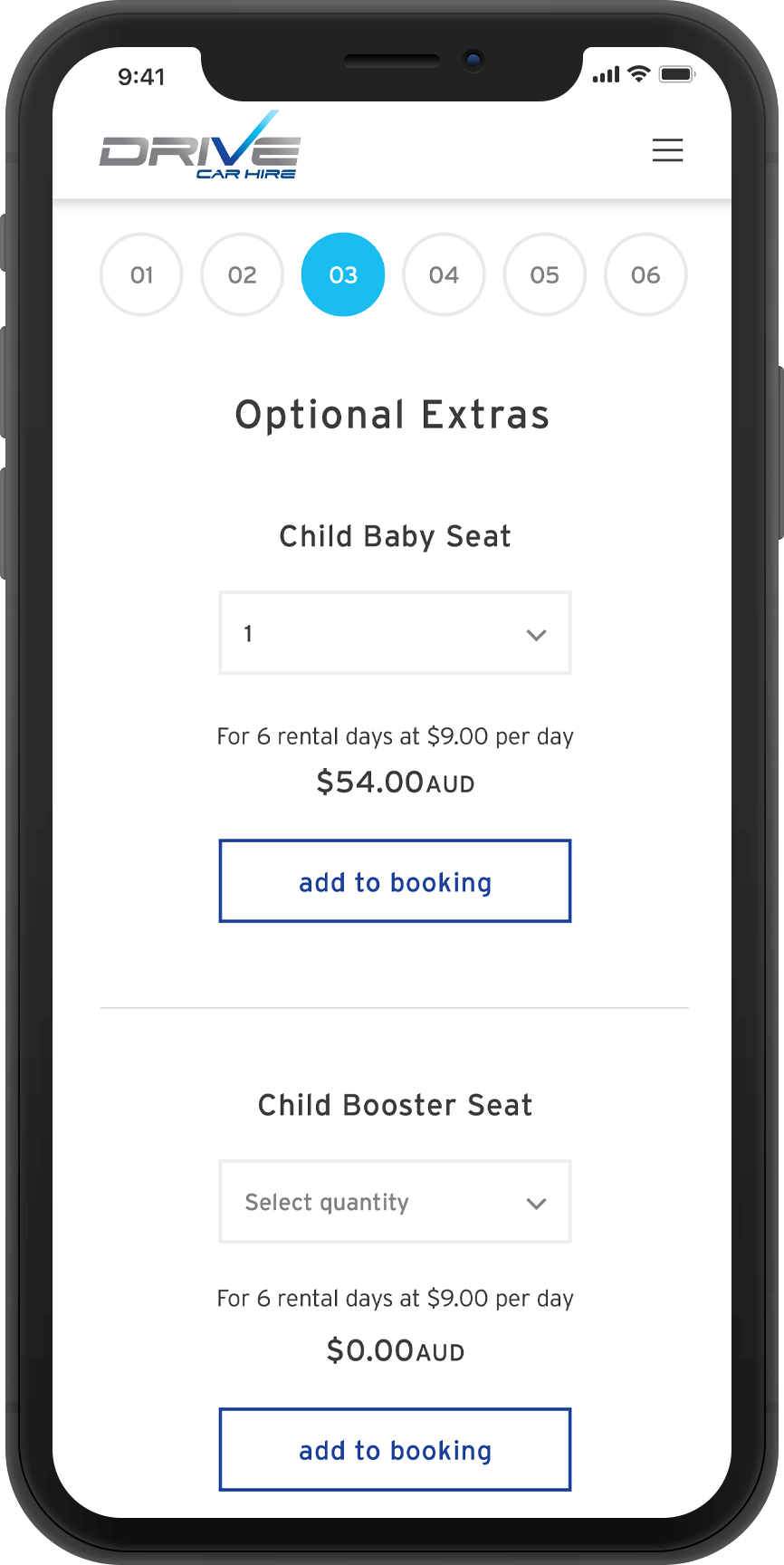
I changed how the insurance was communicated to give more clarity and removed any form fields that requested information that could be asked post booking. I also added a section to allow customers to add any extras like GPS to their bookings which was another common request they would receive over the phone.
We recommended to the client that in order to fully ensure the performance and optimum conversion rates for their website would be beneficial to continue iterating and testing in the future.