Maximum Occupancy
Client
FastrackYears
2018Role
UI designMaximum Occupancy is an accommodation industry conference held in Sydney and Auckland. Every year leaders give insights into current and future trends to help accommodation providers boost direct bookings and maximise revenue.
I was tasked with redesigning and refreshing the brand to make it more modern, memorable and help boost ticket sales. I worked as the sole designer on this project, with another developer.
Discovery
The Maximum Occupancy brand was lacking in personality, and if it was to beat its competitors, it needed a refresh. The logo and brand colours had to stay the same, so the supporting visuals and the way the brand was portrayed needed to pack a punch.
Project goals
-
1
Create a new brand direction for the upcoming conference using the existing logo.
-
2
Design a new website and marketing assets to match.
#114B5F
#717171
#A8A8A8
#1FD3B8
Animation
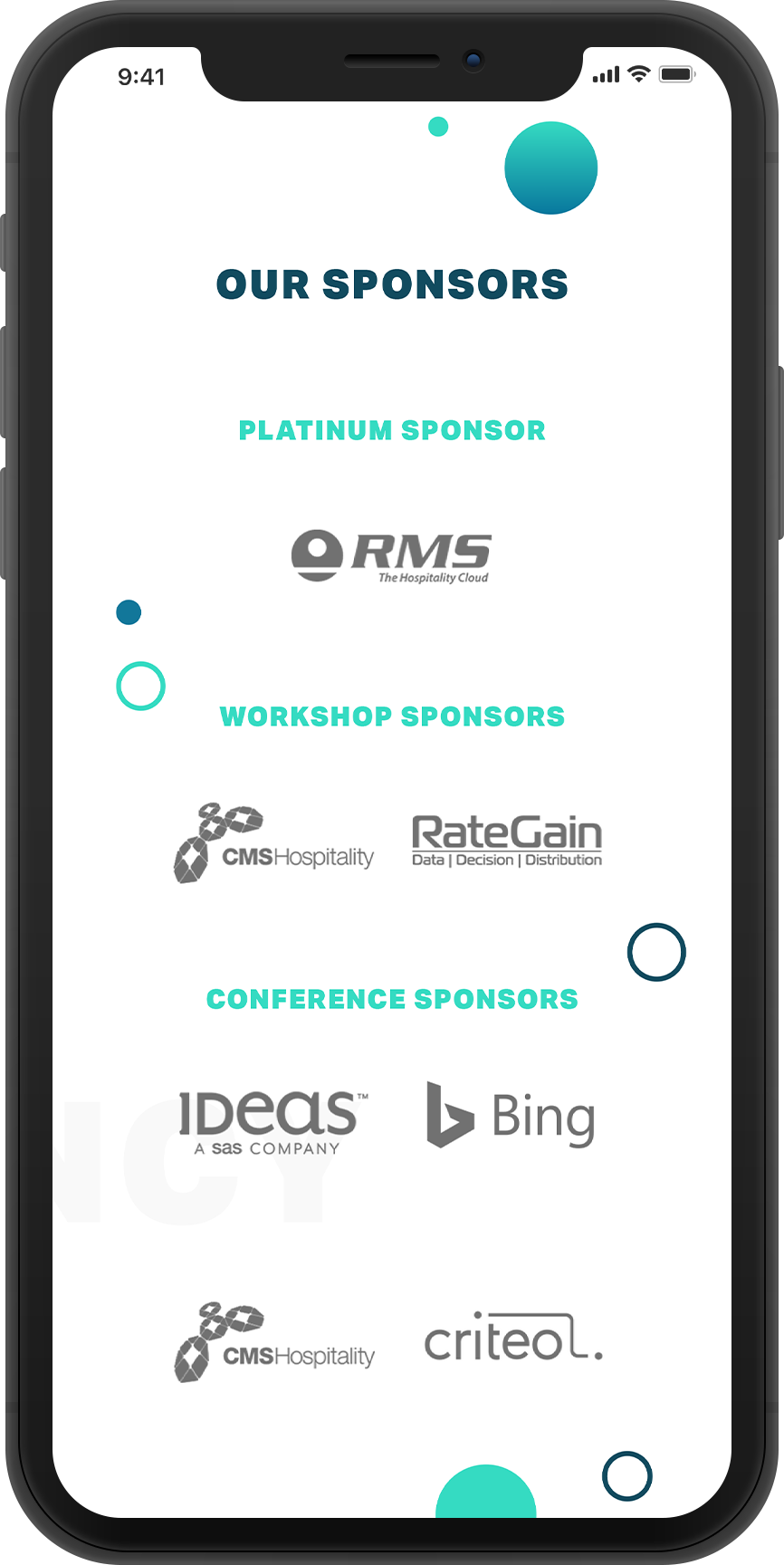
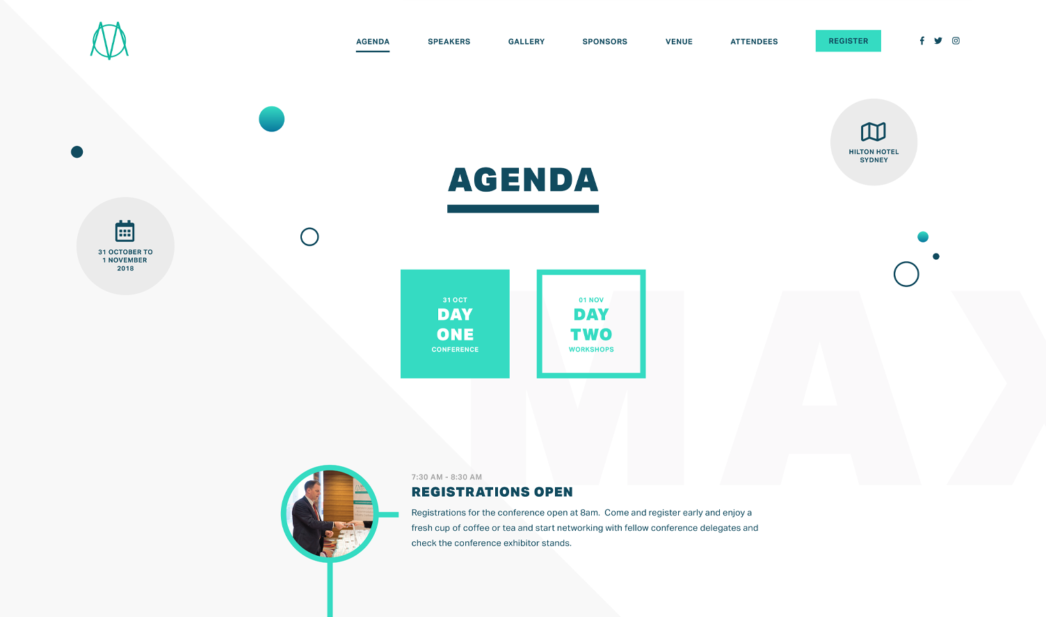
The developer and I worked together to bring the graphical elements to life, animating the SVG’s and adding transitions to the background elements.
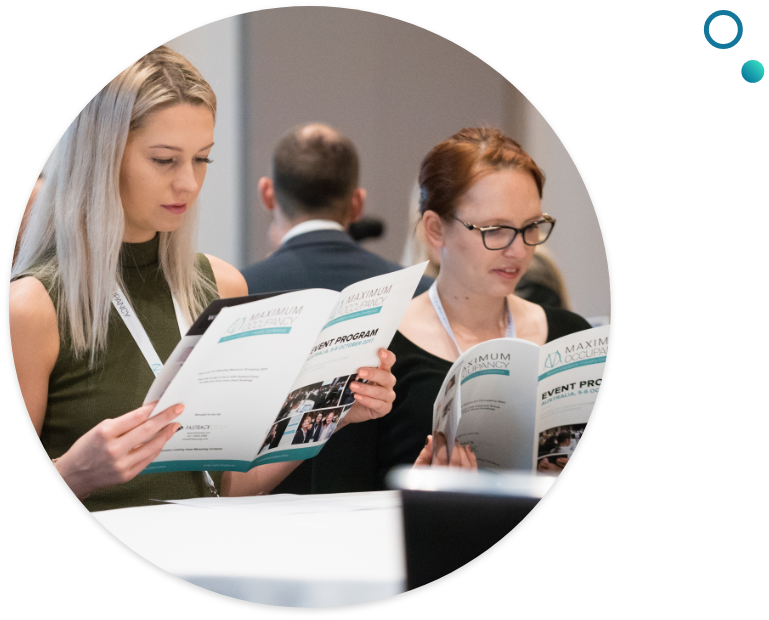
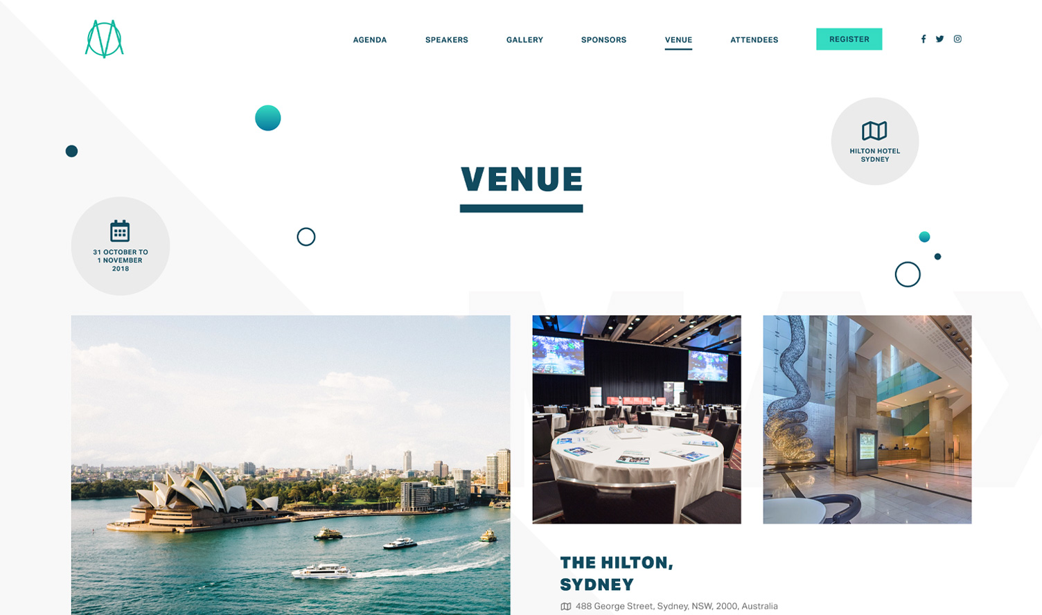
The result was a playful look that took inspiration from the name with contrasting circular shapes and diagonal lines giving the brand a distinct visual presence that gave clear direction for marketing and print collateral.